Ally Corporate Redesign
Background
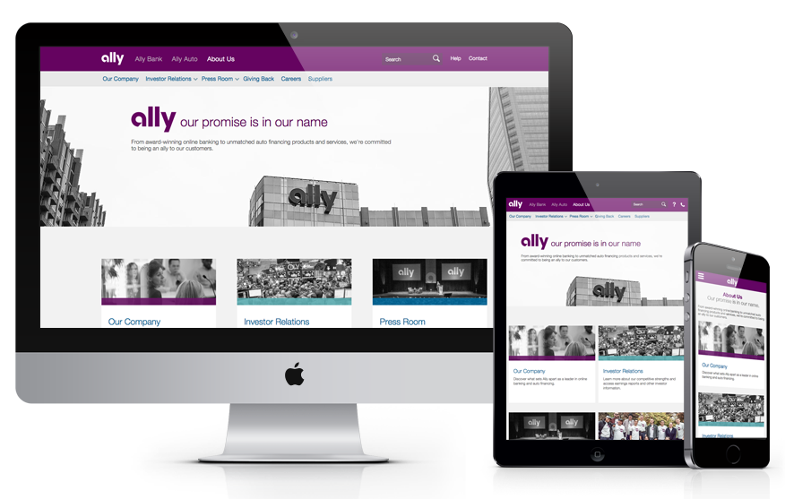
Ally was in business for around 9 years before I came on the scene. The first and most challenging project I was assigned was the About Ally Responsive Redesign. The redesign was challenging because it included 161 pages worth of content that hadn’t been updated in 9 years, all Ally lines of business, over 15 stakeholders, a new brand direction, and a responsive end goal, which was never previously a requirement for any other projects.
Problem
Ally's corporate website was not updated for 9 years... It needed a makeover, a gutting and some empathetic caretakers. That's where our team came in.
Research
We started this project by doing an extensive discovery, which included competitive analysis, persona identification, looking at user path data, journey mapping, content audit and responsive workflow research.
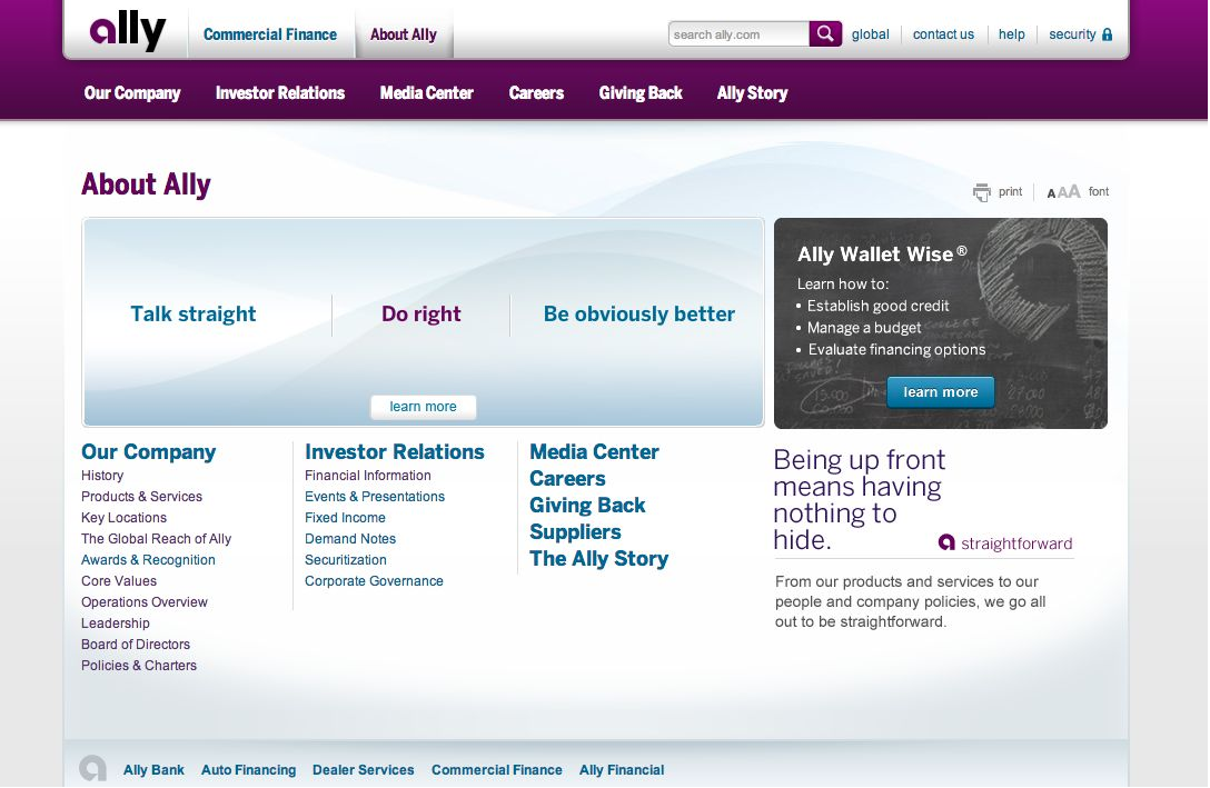
About Ally before the redesign…
Competitive Findings
Navigation - Navigation patterns varied among the companies surveyed (mega menu, simple one level nav, hub and spoke).
Layout and Design - It's common to see imagery of employees, buildings and people in general throughout corporate websites. Design standouts included Target (for unique spin), Twitter (for simplicity), and Visa (for responsive design focus).
Brand - Corporate websites are made to flaunt brand pillars and language that supports those pillars.
Responsive Patterns
Navigation - Most websites at the time were using the hamburger menu at the smallest breakpoint. Variance was seen in the patterns used for navigating through the site hierarchy. Some used an accordion structure. Others used a slide in panel with back button.
In Page Navigation - Most in page navigation was featured at the top, once you scrolled you would have to return to select something else. Some companies provided a back to top button to prevent issues with long scrolling.
Cards - Flexible in size and stack nicely when screen size decreases
Accordions - Work the same whether on Desktop or Smartphone
Personas
Bank prospects don’t really need much convincing. They know we're a bank. They're mainly checking here to see if we are FDIC insured. They read through the our company page and may or may not go into other sections. The key objective with this group is to make sure they understand we're an online bank.
Investors need lots of convincing. They want to know how we would differentiate ourselves from other companies, what's on the docket for the year and what's happened in the past that could be a benefit or deterrent. Investors are intense researchers. They read through all the content to understand all the different facets of the business before moving forward. They read through press releases and want to see your spin on events. The key objective with this group is to make sure they can find what they're looking for by providing a good, clear navigation scheme. They will go into the depths of your website to research.
Journalists that come to the corporate website are either learning about the company or are reading press releases. They're on a deadline and they don't want navigation getting in their way.
Auto prospects might come to see what the company's about, but will most likely choose the best deal they get at the dealership. They're not as concerned with how the business is doing.
Suppliers come to the corporate site to find contact information and details about supplying products to Ally.
Grant seekers only come to learn about what we offer and how.
Job seekers come to search positions. Usually they will search positions then go back to the corporate website to understand the lines of business at a high level and discern from look and feel what the culture is like.
Journey Maps
This project ignited my love of journey maps. It was the first time I created one and it was an eye-opening experience. Journey maps helped us get the business owners to understand the issues users were having and how we could solve them.
By stepping in the shoes of the different users we learned that we needed to provide them with different types of content.
For bank customers and prospects we needed to…
Communicate who we were and what we did upfront
Communicate the depth of our company to make customers feel secure
Help users understand our history
Improve their overall understanding that Ally was an online only institution
For investors we needed to…
Communicate value prop, “Why should I Invest?”
Improve subscription outreach to Investor Relations users
Clean up links to unexpected 3rd party content
Simplify disclaimers
Provide access to stock information and charts
For journalists we needed to…
Update our navigation labels to be more user friendly and searchable
Improve outreach methods
Provide a way for journalists to find specific press releases
To learn more about my journey mapping experiences read Adventures in Journey Mapping.
Content AudiT
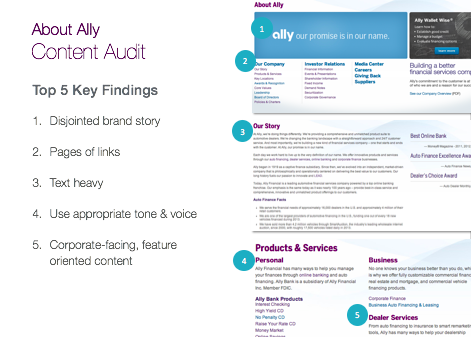
We did a content audit to better understand how the navigation should be structured, get a picture of what new content needed to be created, what was redundant and how our brand was represented across the site.
Key Findings
There was a disjointed brand story, without a strong narrative. The content didn’t really reflect the brand that Ally had become. The language was weak and lacked the aspirational tone of the other parts of the website.
There were too many links to individual pages with content that was relatively similar.
Overall there was just too much text without supporting imagery.
Corporate speak was woven throughout the content and most wouldn’t really make sense to a user.
Card sorting
We did a card sorting study to understand where we could improve the navigation. We gave users the current navigation content options and had them sort them in an open card sort to see how they would naturally categorize all of the content. The top categories that came out of the card sort helped us shape the primary navigation.
Responsive
When we started the redesign, we knew we wanted everything new that we created to be in a responsive framework, which hadn’t been tackled before at Ally. Much of the challenge was getting everyone to understand what responsive design meant. To help ease the struggle our team created a collection of research showing what responsive design is, how it works and why it was needed at Ally. View Research
Sketching
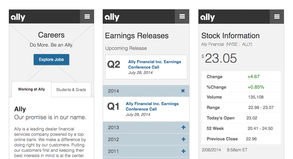
After discovery, we started sketching what the experience might look like, paying close attention to the gaps we found in each journey map and the findings from all the other research we did. It didn't take long for us to come up with a few solid ideas to review with the stakeholders.
Solution
Navigation
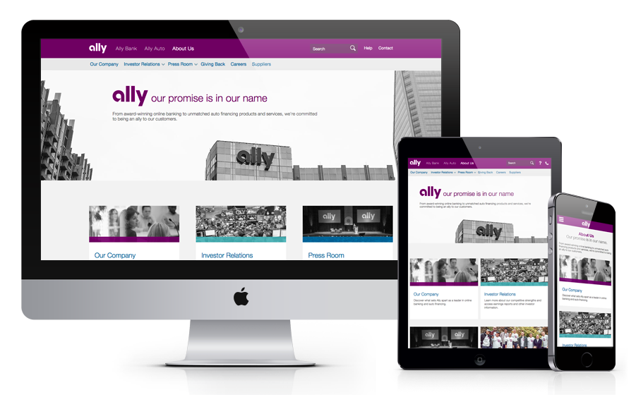
Simplified navigation from 161 pages to 92 and created a clear path for each persona with a hub and spoke model based on interest from the about us home page.Content
Revamped the content on each page to tell a story with the Ally brand tone and voice.Design
Redesigned all pages and media, integrating photos of employees and actual representations of how we work.Structure
We utilized multiple page structures based on the persona using them. A hub page was used to get customers to the right starting place. With so many personas a hub structure made the most sense and created a simple entry point based on user goals. A long scrolling page was used to tell a story and engage customers. A right rail was used throughout to help customers way-find and get to pages that were interrelated and relevant to the user groups that were accessing them.